Overview
Standardizing filter component using atomic design approach
Role: UX design, Usability testing, Visual design
Getting Started
Step 1
Gathering filters from different products
Step 2
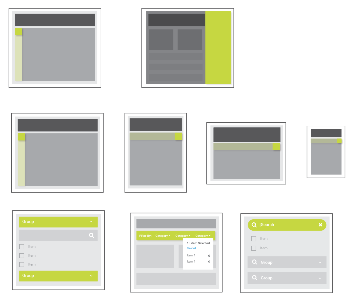
Breaking filter into parts for further refinement
Iteration A
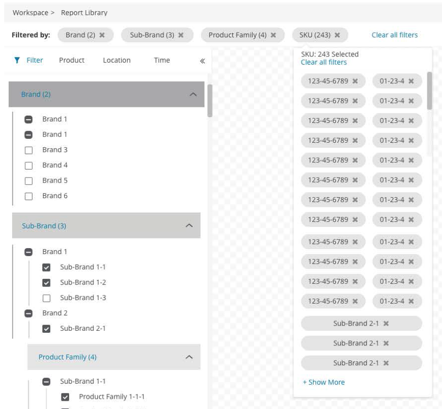
There are two types of filters that currently exist in iLab products: (1.) Standard Filter (2.) Nested Filter. There is not much to standardize for standard filter other than maintaining visual consistency, so I focus on nested filter instead. I started with the most complicated filter existed in our product and conducted a usability testing.
“I have no clue where I am right now. Let me just clear everything and start over.”
“This is a mess.”
“I really don’t understand how this works, the logic is very difficult to follow. ”
Iteration B
After first round of usability testing, I consulted with the team that currently used the most complicated filter system and understood their business goals for designing filters. (A) easy to refine filters (B) able to come in any level to choose filters (C) easy to bulk select, search, and reset. I brought this feedback to creative meetings and work with the team for some alternative approaches.
Tree vs. Accordian
Understanding goals and shortcomings for what creative team is proposing and what is currently being implemented
Visualization Attempt
Visualizing how tree structure will work under nested filter logic
While I attempted to blend tree and accordion to highlight parent-child relationship using tree structure, it turned out the structure is just getting more and more complicated to understand.
So, Yeah
It did not work.
Iteration C
I understand that while using tree structure will show parent/child relationship perfectly, it does not allow user to come in any level to freely choose filters. I abandoned this attempt instead, and started competitive analysis on other sites to see if I can find more inspirations. Since Carmax has the most clean and easiest UI, I used our client data to do another round of testing to see if this logic works.
Iteration X and more to come!
I conducted another round of usability testing using Axure interactive prototype this time instead of real time code.
UT Finding
1. Users really liked the tracking of filters on the dashboard.
2. Users took some time to understand the cascading filters pattern and weren’t convinced it was the easiest way to filter.
I'm planning to add search and clear to make the filter component more complete. I'm working on another round of testing to incrementally improve this component. I plan to focus on visualization at this point to create Sketch and Axure component for my team as future use.


